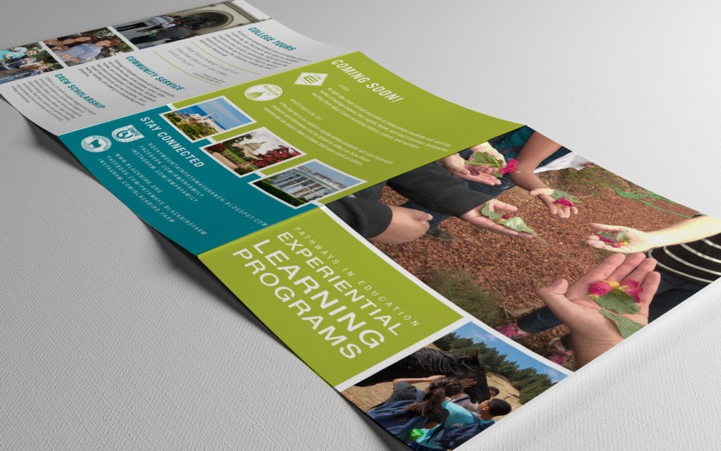
14 Jun Brochures that People will Actually Want to Read
Lately I’ve been getting a lot of design requests for brochures or brochure re-designs and wanted to discuss design concepts that will hopefully entice your potential customers to actually read your brochures. Brochures are often mailed, displayed at the business, or given away at events to give consumers information about your business, what you sell, and what the customer can gain from it. Other times, the brochure is strictly informative with no marketing messaging at all, such as a national park brochure. Regardless of the type of content your brochure contains, you want to convey a clear message that is easy for the reader to understand with a design that visually stimulates the reader to open the brochure and read each panel.
Don’t let your brochures be a wasted expense.
Advertising, especially print advertising, can be expensive, especially if you put the necessary funds into producing a beautiful brochure. Sometimes clients want to fill brochures with endless copy, which requires a smaller font size, and allows for less design elements. This will completely deter readers from actually going through each panel of content and engaging with your brand. After you’ve developed the copy you want to give your designer, re-read it and cut it down, and then repeat, and re-write if necessary. Ask yourself, what is the message you are trying to get across in each body of copy and what is just filler copy that the reader doesn’t need? Highlight the most important points about your brand or information and make it clear and concise. After the copy has been finalized, it’s now in the designer’s hands to display that content and supplement it with photographs, color, typography, and design elements that support the content and make it appealing. Here are a few design and production tips that will set your brochure apart from others and attract people to actually read every word:
- Use powerful photographs that give the reader a feeling for your brand.
- Invest in superior materials. When someone picks up your brochure they will immediately feel the difference in quality paper or finishes that will allow it to stand out among the rest.
- Consider a different sized brochure. Instead of doing the typically tri-fold 8.5×11 brochure, think about how your information might be used in a two panel, booklet, or a one that is wider or shorter than the standard to, again stand out and get noticed.
- Break up your copy with distinctive headlines that simply describe the information they are going to read. Just as in web design, allow the readers to easily find the information the best pertains to them.
- Use bright, but relevant, color and design elements that define separate pieces of information.
- Name your brochure front panel with a meaningful title, using clean typography.
- Use negative space! Healthy panel margins and space between each piece of copy will prevent the brochure form seeming cluttered and the reader from being overwhelmed.
- Consider how your brochure will work in a system among others. Do you plan on creating additional brochures for your company? How will they relate and differ? You want to maintain the same look and feel, but differentiate the content using a distinct design element such as color.
For some more brochure ideas I found this blog article that I really like by DIY Marketing on 21 Creative Brochure Design Ideas for Your Inspiration.