

Category
Branding, Print DesignAbout This Project
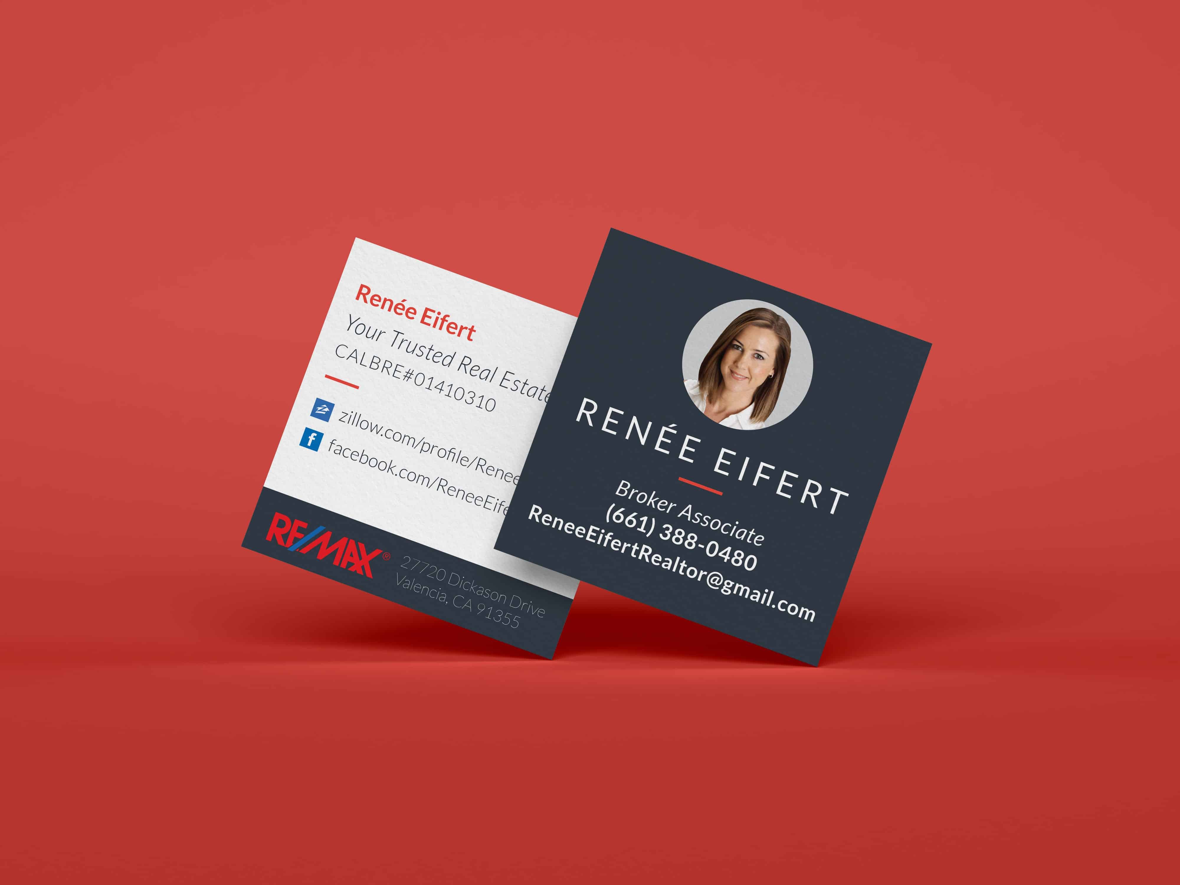
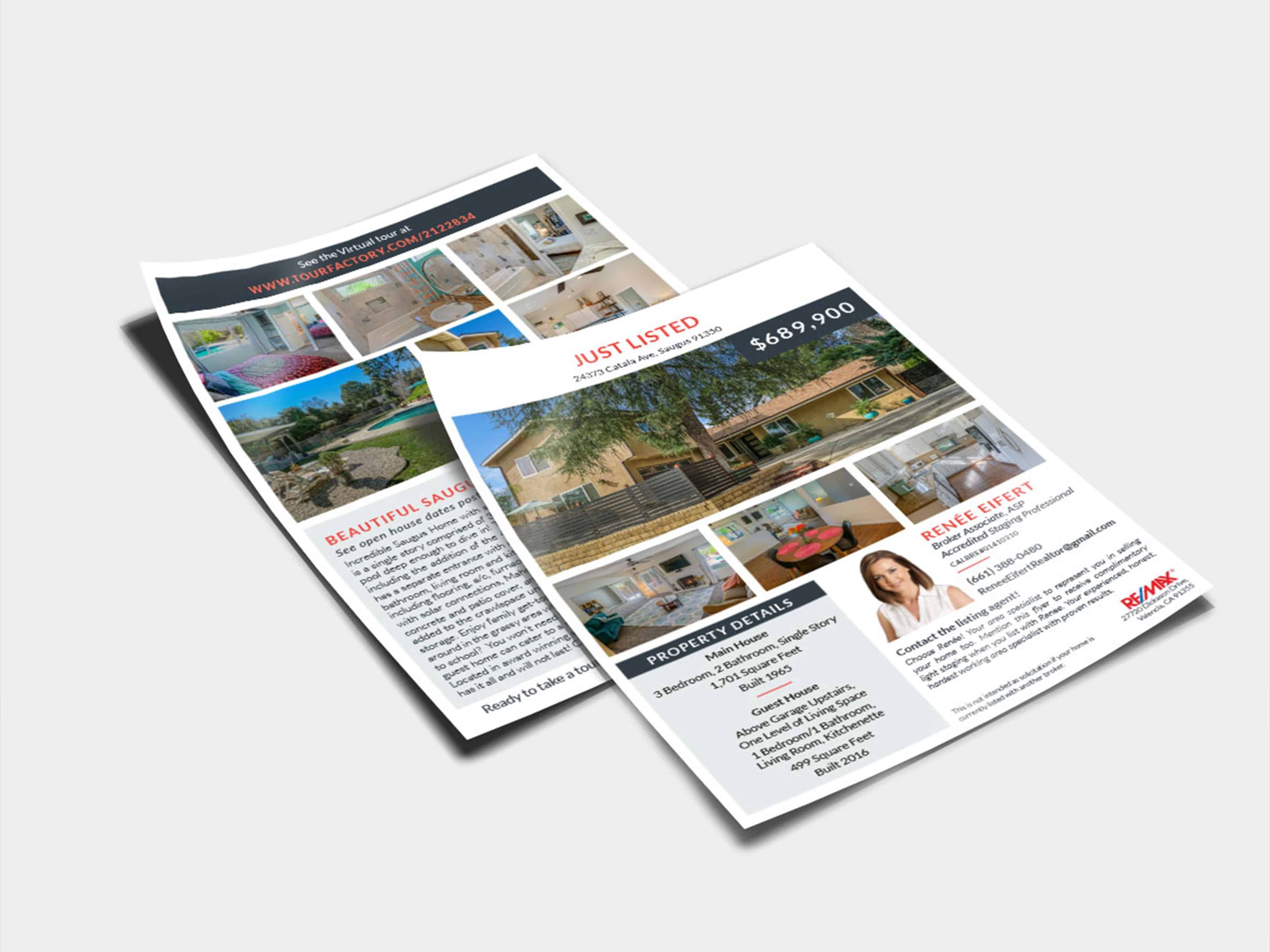
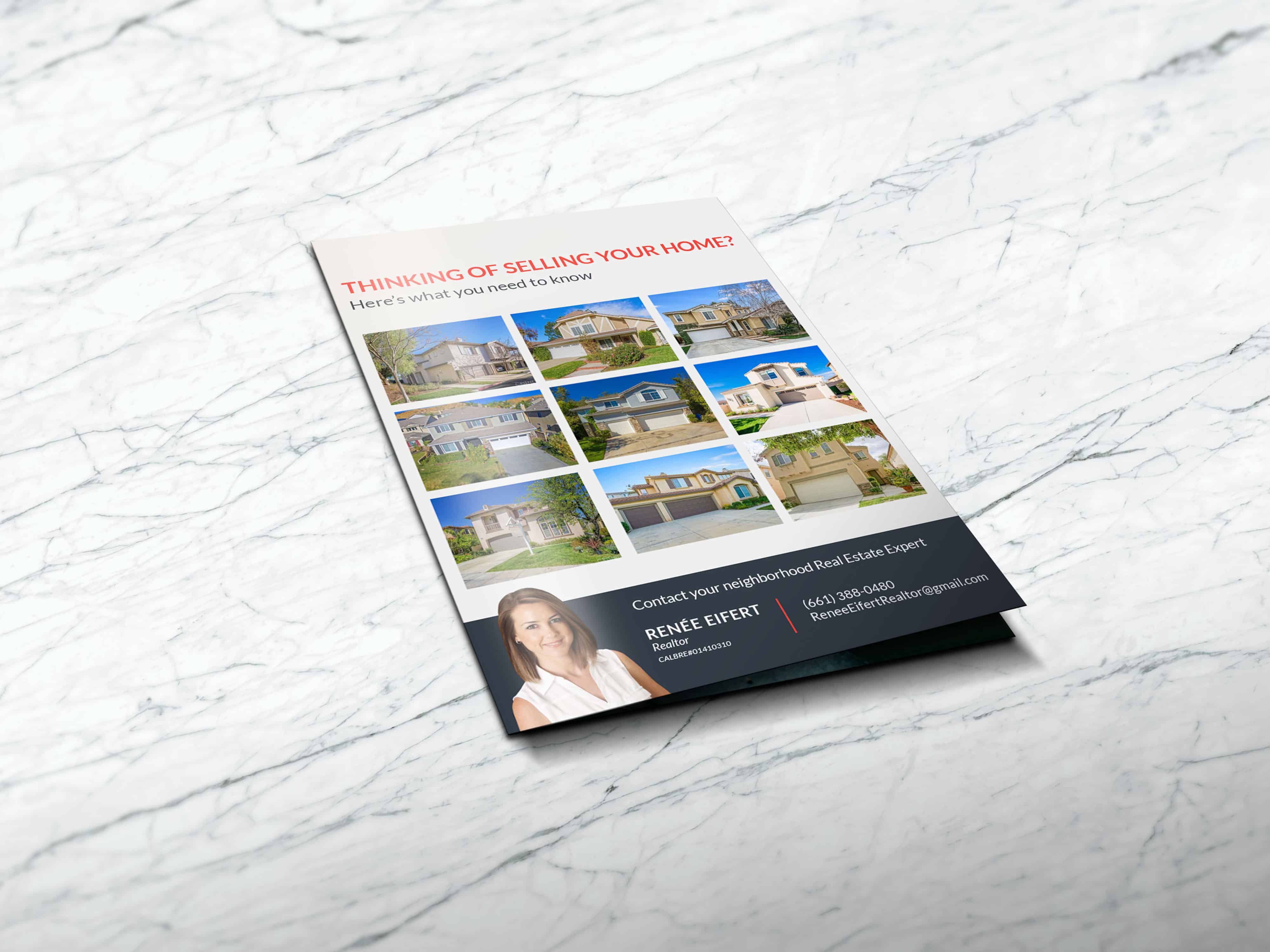
Renee is a local real estate agent who needed a new look and feel for her advertisements. I created a cohesive identity system for her to promote herself and her new listings. I used modern typography, a two color scheme that includes a lighter more feminine coral color and a bold gray/blue for a more professional balance that will work across her system. The design elements follow a grid system that create an optimal layout for property photography and listing information.