Category
Branding, Digital Design, Web Design & DevelopmentAbout This Project
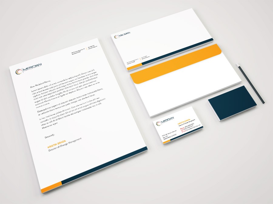
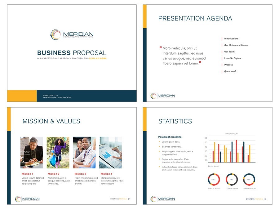
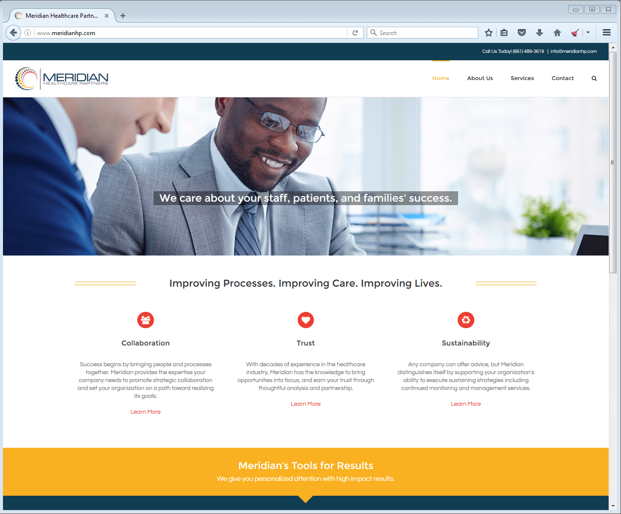
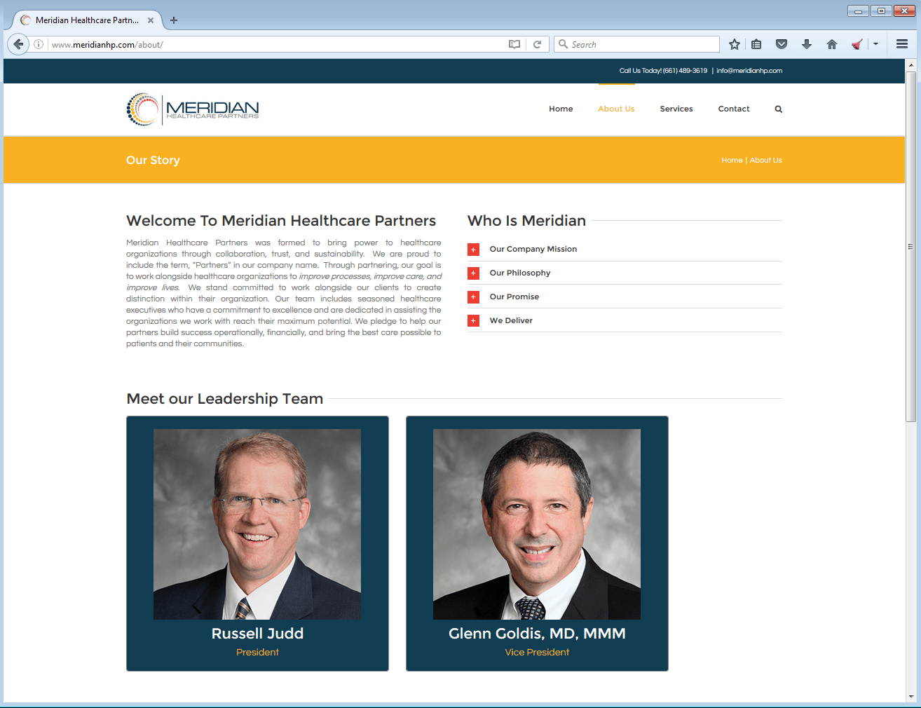
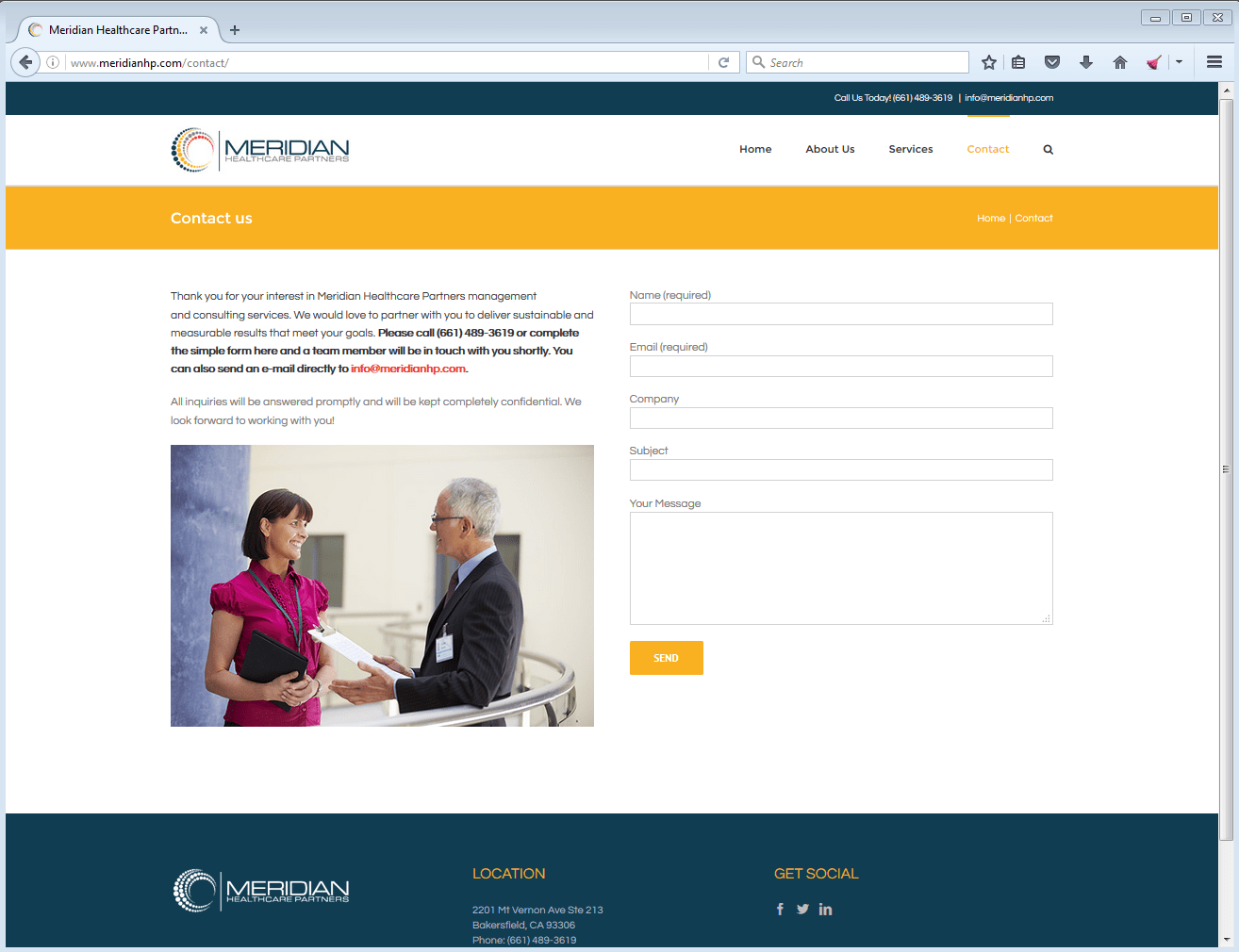
Meridian Healthcare Partners needed an identity system using their current logo. The identity I created for them includes business cards, letterhead, envelope, PowerPoint template, and a website. Upon exploring various layouts, colors, and design elements for the Meridian Identity system, I made the recommendation to change the colors present in the logo icon and the concept was accepted by the client. The new colors where then used across the identity system in a series of yellow and navy blue bars. The design elements are modern and simple, but use these new bright colors to reflect the consulting company’s personality and role in the healthcare industry. Website was designed using WordPress and is fully responsive for desktop, tablets, and phones.
See the website here: http://www.meridianhp.com/
