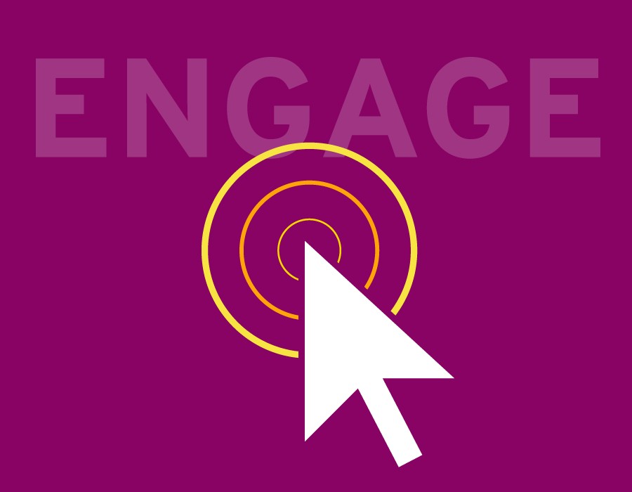
19 Jul How to Make your Website More Interactive
There are a few must-have features of websites that are expected with today’s modern scroll and swipe world that have become every user’s norm. Whether on a desktop, tablet, or mobile device there is a certain level of interactivity and response we users expect to have when browsing websites. For mobile users, people are so used to tapping and swiping now, that if your website does not have these abilities it will most likely be exited and forgotten about. On a desktop computer, an intuitive navigation and insightful animation can help the user stay focused and find the information they need. These design elements not only make the website more engaging, but they enhance the user experience and guides them to where you want them to go.
So how do you make your website more interactive? One major current trend is parallax scrolling which I’ve talked about in a recent article titled “Parallax scrolling…to do or not to do?”, where elements on the page change as the user scrolls. Some entire websites now are one page that you continuously scroll as different elements change. This approach can be effective when it is done simply and supports the message on the page. The act of scrolling whether it includes some kind of animation or not, is a trend that is becoming more and more intuitive to every day website users. Effective web designs indicate the website is scroll oriented upon the user immediately entering the site with some signal for them to scroll such as an icon or side navigation that defines its vertical functionality. Simple ques can really enhance the interactivity they can expect and is almost a teaser for them to scroll to find out what they will see next.
Other more subtle features that have a big impact on interactivity are icons, hover effects, video, and zoom. Icons are more powerful now more than ever as consumers have less time to read and rely heavily on visually indicators. A good icon can have movement, be static, small, large, part of the navigation, or be a part of an infographic. What all icons have in common though is simplicity. The icon must be universally easy to understand. Hover effects are one of the most sustainable design elements that almost every user needs when interacting with a site. The effect reassures the user the site is working with them and they are clicking in the right place. The effect can be subtle such as a highlighted text color, or dramatic with large blocks of color changing as the user hovers over the element. Using photo hover effects is a big trend right now too with opacity and saturation effects for a more artistic interaction. Designers are getting more and more creative with their hover effects, and I welcome them all! I think they are a great way to engage people and result in more clickthroughs and page visits site-wide.
Two interactive features that work really well on e-commerce, product based sites are video and zoom. Video has emerged significantly on the web. It is now used as entire website backgrounds, hero images, and in call to actions. It works so well because, again we are becoming more and more visual people where we don’t want to read, we like to see what your product is first hand and not have to research and dig to understand it. Videos capture the viewers’ attention and allow them to be immersed in your experience. The zoom feature also works in this way in the sense that people want to see your product, up close and in detail. If I am on a product page and cant zoom in on a photo, most likely I won’t buy it because I can’t see exactly what I am purchasing. These are all great features to add to your website, but as always the simpler the better. Sometimes these things can be overwhelming to viewers or cause your site to run slower. If used in moderation and to enhance the user experience, interactivity can drastically improve your website engagement.