
Category
BrandingAbout This Project
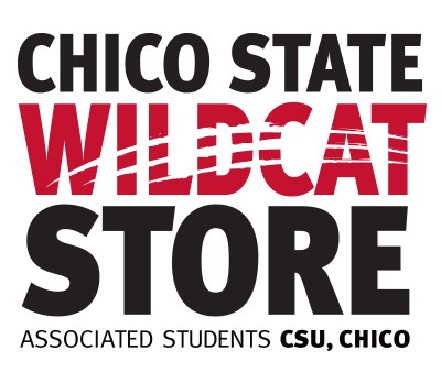
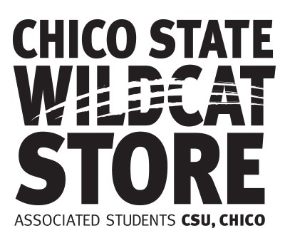
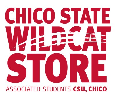
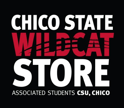
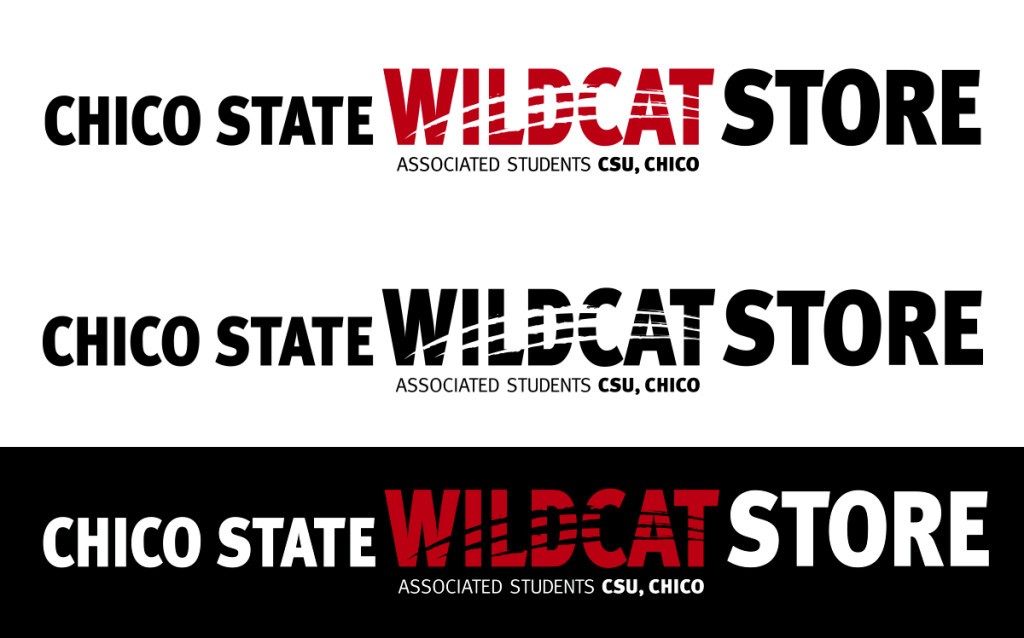
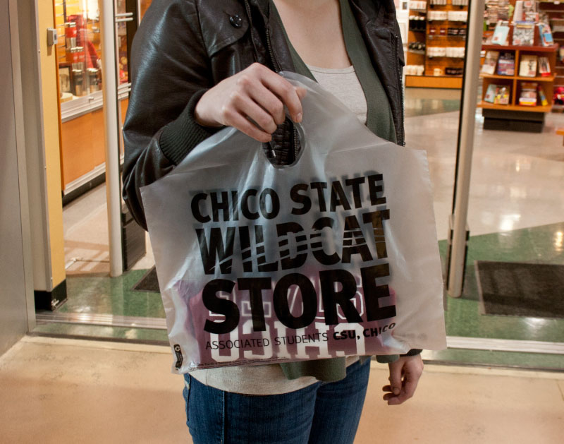
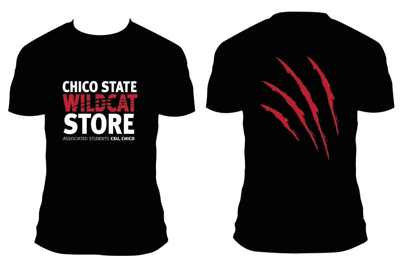
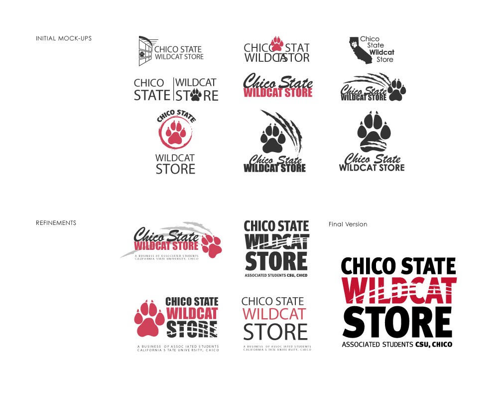
The Chico State Wildcat Store needed a new identity (previously the “Associated Students Bookstore”). My job was to connect the Wildcats (students at Chico State) to the store and incorporate the idea of school spirit. In order to do this, the emphasis was placed on the word “Wildcat” by using cardinal red, which is one of the school’s colors. The challenge was to make the graphics resemble a wildcat, and find a friendly medium between a nice wildcat and a more aggressive look. I addressed this problem by adding elements that referred to a wildcat paw print. The final mock-ups included the scratch marks inside the letterforms so the paw print would be implied and the graphics were simple enough not to be distracting from the name itself.